
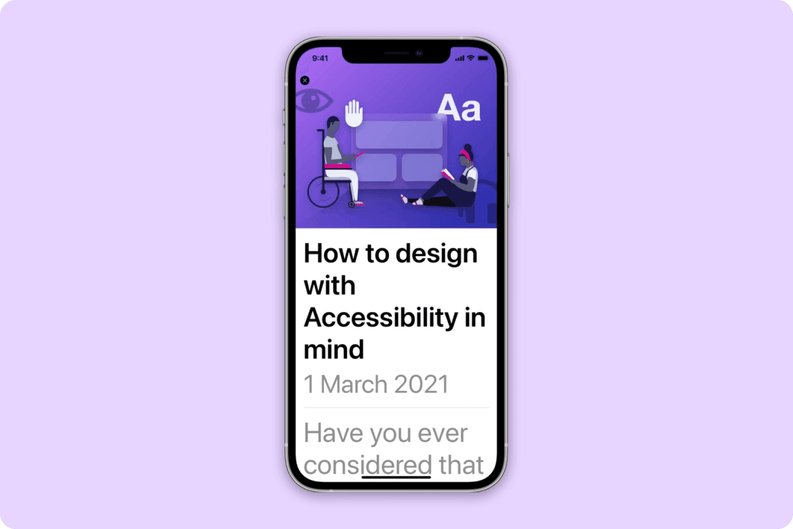
Have you ever considered that your design may not be accessible to all your users?
You, or someone you know, could be dealing with an impairment; This is not limited to, but may include colour blindness, loss of hearing, difficulty reading, physical disabilities, or temporary impairments such as having your arm in a cast.
By designing with accessibility in mind, you make it easier for all people to interact with your product. Let us go through some key accessibility features we consider when creating user interfaces design for iOS and Android.
1. Text Accessibility
Native fonts and default text
Make use of native fonts and default text sizes. The easiest way to do this is to download the design libraries for the platformyou are designing for. You can find the resources for both Apple and Android here:
Apple Design Resources - https://developer.apple.com/design/resources/
Android Resources - https://material.io/resources
By using these default font sizes, you cater for dynamic text. This will allow text to scale according to the user’s preference.
Things to avoid when making text accessible
If you must make use of custom fonts, because of your client’s corporate identity, we suggest sticking to default text sizes and ensuring that your development team add accessibility labels so the text can scale dynamically when needed. Make sure to test that your text scales accordingly and that your labels do not truncate (Unless the user can tap through to a detail view where the entire text label is visible).
Avoid light and italic font weights as this not only affects contrast ratios, but makes it difficult to read for users with visual, learning and literacy impairments.
Avoid justification. Use text sizes to create hierarchy in your design through titles, sub-headings and body copy - leading the eye from most to least important - to increase the experience for these users as well.
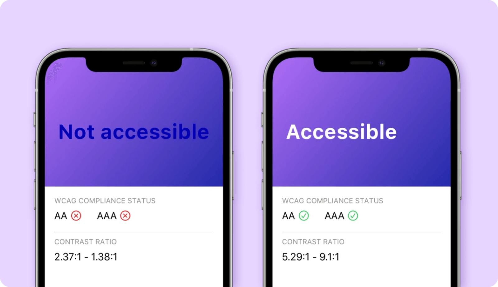
2. Colour Contrast
Ensure contrast ratios of:
4.5:1 - For text sizes up to 17pt
3.1 - For any bold text or large-scale text size 18pt and above
Contrast ratios measure the difference in colour luminance of your foreground versus your background. Ensuring WCAG (Web Content Accessibility Guidelines) compliant contrast ratios is vital to achieve accessibility for visually impaired users - As it ensures that users with 20/40 vision (Similar visual acuity to that of an 80-year-old) can still discern the information on screen.
[Source: https://www.w3.org/TR/UNDERSTANDING-WCAG20/visual-audio-contrast-contrast.html]
How to test your colour contrast
We find some colours are not that visually palatable at their acceptable contrast ratios - In these scenarios we suggest using the original colour and asking your development team to add accessibility labels to switch to the accessible colour versions when system settings are turned on.
You can use the following plugins to test colour contrast in your design:
https://www.getstark.co (Sketch, XD and Figma)
https://cluse.cc (Sketch)
Consider your colours
Consider your colour-blind users and avoid colour combinations such and red and green, blue, and purple, etc. If you must use colour combinations like this, add text labels and iconography to increase the clarity of your content.
Do not use colour alone to convey meaning in your design, for example success or error states. Always include text labels and iconography to make the meaning clear.
3. Interactive Elements
How big should tappable areas be?
Ensure that interactive elements such as icons, tiles and buttons have the following tappable area size:
iOS - 44 x 44 pt
Android - 48 x 48 pt
In scenarios where these elements are smaller, include padding around the object to achieve the tappable area targets. This allows users with physical and motor disabilities to better interact with your design.
4. Navigation
Alternative text labels
Provide alternative text labels for assets and functional imagery (Imagery essential to convey information), to assist users who enable TalkBack (Android) or VoiceOver (iOS). Ensure elements are grouped for these labels to be read out in the correct order.
Alternative user journeys
Consider users with visual and/or physical impairments before you introduce additional security features in your design, such as capturing a selfie with on-screen prompts. If users cannot complete the action, they may have no other way to progress through your journey. If your user has accessibility settings turned on, offer them an alternative way of navigating your app.
Always test your designs
Make sure you test your own designs by enabling accessibility in your system settings. Experiment with dynamic text sizes, enable Talkback or VoiceOver and test if you can still complete your user journey by only following voice-prompts. Have users with impairments test your app to see how you can improve. If your development team makes use of Xcode, ask them to use the Accessibility Inspector to audit your app for any accessibility issues.
To learn more, access the links below:
iOS - https://developer.apple.com/design/human-interface-guidelines/accessibility/overview/introduction/
Android - https://material.io/design/usability/accessibility.html
Additional Reading
Learn more about the basic principles of accessibility design and how to start applying them today in this article we worked on with Sketch: https://www.sketch.com/blog/gaad-accessibility-day/


